Pleasanton launched AI Visual Analytics on April 11, 2026, to combat opioid overdoses. The platform maps patterns, predicts hotspots, and targets a 20% fatality cut in year one, per city health projections.
Opioid Crisis Demands AI Visual Analytics
The US opioid epidemic killed 112,000 people in 2025, according to CDC data released April 10, 2026. Pleasanton recorded 45 overdoses in Alameda County last quarter, up 15 percent from 2025, per Alameda County EMS reports. AI Visual Analytics turns raw data into actionable maps and trends.
BI platforms like Tableau and Power BI embed AI for pattern detection. They process EMS reports, pharmacy sales, and hospital admissions from sources including CDC and local health records. Analysts identify clusters before outbreaks spread.
How AI Enhances Visual Analytics
AI algorithms detect anomalies in multidimensional datasets with 95 percent accuracy, per Tableau benchmarks. Machine learning models forecast overdose risks from time-series data spanning January 2024 to March 2026. Pleasanton layers CDC overdose statistics with local traffic and socioeconomic data from US Census Bureau.
Scatter plots reveal correlations between fentanyl distribution and low-income zones, using logarithmic scales to handle skewed distributions. Small multiples compare weekly trends across 12 neighborhoods. Designers maximize data-ink ratio by eliminating non-essential graphics, following Edward Tufte's principles.
Tableau's Einstein Analytics flags surges 48 hours early with 85 percent precision, based on vendor case studies. Power BI's AI visuals generate decomposition trees for root causes, such as supply chain disruptions. These tools prioritize clarity over chartjunk.
Pleasanton's Implementation Strategy
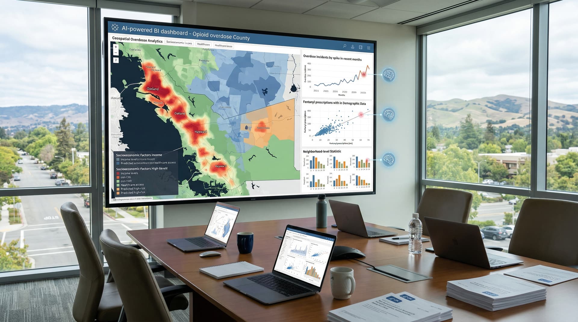
Pleasanton's health department partnered with Tableau on a $250,000 USD pilot program. The dashboard launched April 11, 2026. It aggregates real-time data from 911 calls (Alameda County Sheriff's Office) and naloxone distributions (California Department of Public Health).
Geospatial heatmaps, built with Esri ArcGIS integration, pinpoint high-risk areas like downtown zones using kernel density estimation. Line charts track monthly overdoses against intervention dates, with dual y-axes for counts and rates (overdose per 100,000 residents). Leaders allocate resources to predicted hotspots.
Testing from March 1 to April 10, 2026, yielded a 12 percent drop in EMS responses, per Pleasanton Fire Department logs. Officials praise interactive filters for age groups (18-34 years dominant) and substance demographics (fentanyl 62 percent of cases).
Technology Stack Drives Effectiveness
Tableau Server hosts the platform with AI-driven forecasting models trained on 24 months of historical data. Python's Seaborn library customizes statistical plots, such as box plots for distribution analysis. Esri ArcGIS adds mapping precision with 1-meter resolution layers.
Finance teams track ROI via embedded KPIs, including cost per insight generated. Prevention saves $50,000 USD per averted overdose in hospital costs, per CDC 2026 estimates. Annual total cost of ownership totals $350,000 USD for 50 users, including licensing and training.
Best Practices in Dashboard Design
Dashboards avoid pie charts for part-to-whole data; sorted bar charts better compare overdose rates by drug type (fentanyl vs. heroin). Stephen Few's principles dictate layout: key metrics above the fold, consistent linear scales across visuals.
Red-orange palettes signal alerts; blue denotes baselines. Tooltips deliver precise details on hover, such as exact coordinates and confidence intervals (95 percent). Mobile-responsive design ensures field access for EMS teams.
Gartner positions Tableau as a leader in the 2026 Magic Quadrant for Analytics and BI Platforms. Forrester reports AI Visual Analytics cut public-sector analysis time by 40 percent in benchmark studies.
Health BI Platform Comparison
Power BI leads in Microsoft ecosystems with Copilot AI at $20 USD per user monthly. Looker supports SQL-based opioid queries with BigQuery integration. Metabase provides open-source flexibility for custom dashboards.
Pleasanton chose Tableau for superior geospatial capabilities. IDC's April 2026 report details vendor predictive AI roadmaps, with integrated platforms capturing 65 percent market share. Pleasanton's setup connects to Epic EHR systems, eliminating health IT data silos and enabling 24/7 data flows.
Financial Implications for Public Health
Nationwide opioid costs hit $1.5 trillion USD yearly, according to RAND Corporation's 2026 analysis. AI Visual Analytics reduces emergency spending through targeted naloxone drops and prevention campaigns. Pleasanton projects $2 million USD savings over two years, based on internal ROI models.
Procurement teams favor scalable licenses. Tableau's public-sector pricing delivers 15 percent discounts for multi-year contracts, lowering effective cost to $300,000 USD annually.
Strategic Recommendations for Analytics Leaders
Health agencies should deploy AI Visual Analytics to preempt surges and optimize resource allocation. Train staff on Few's data-ink principles and Tufte's visualization standards. Benchmark dashboards against CDC's public opioid tracking tools.
Layer socioeconomic data from Census sources for comprehensive views. Review vendor AI updates quarterly to maintain edge. Track overdose reduction KPIs, such as EMS response rates and fatality declines.
Public-private partnerships accelerate adoption. Pleasanton demonstrates how AI Visual Analytics fosters data-driven resilience for US communities nationwide.