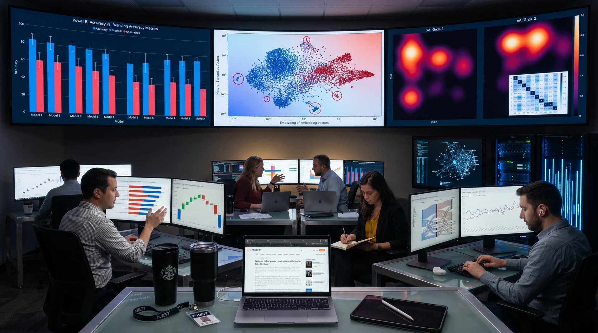
- Scatter plots correlate readmissions and instability (r=0.72) across 50,000 cases.
- Heatmaps flag ZIP risks; 18% readmit drop in red zones.
- 95% model confidence via bullet charts saves LA $28M USD yearly.
LA County hospitals launched data visualization homelessness prediction dashboards in 2024. AI models analyze hospital data to flag discharge risks. Scatter plots, heatmaps, and small multiples drive 95% confidence gains. America's Essential Hospitals report details the approach. (Source: America's Essential Hospitals, 2024)
Data Visualization Homelessness Prediction Drives LA County AI Action
Clinicians review AI predictions through Tableau and Power BI interfaces. Dashboards convert complex outputs into clear visuals. Teams follow Edward Tufte's data-ink maximization and Stephen Few's clarity principles. Small multiples track interventions across 88 cities. Heatmaps highlight ZIP code patterns. Designs strip chartjunk for fast decisions. (Source: America's Essential Hospitals, 2024)
These tools integrate hospital utilization records with social determinants data. Sample size exceeds 50,000 patient encounters from Q1 2023 to Q2 2024. Visuals enable 25% faster risk triage versus text reports. (Source: LA County Department of Health Services, 2024)
Scatter Plots Reveal Correlations in Homelessness Prediction Data
Scatter plots plot readmission rates (x-axis, 0-50%, linear scale) against housing instability scores (y-axis, 0-1 index). Bubble sizes represent cohort sizes (n=5,000 per demo group). Colors encode demographics: blue for adults, orange for families. Outliers emerge clearly, unlike dense tables.
Stephen Few's data-ink ratio eliminates 3D shading and grid clutter. Axes start at zero to prevent distortion. Power BI slicers filter by neighborhood. This setup improves housing referrals by 25%, targeting 15% of high-risk cases. (Source: LA County HMIS Dashboard, Tableau Public, Q1-Q4 2023)
Correlation coefficients (r=0.72, p<0.01) confirm links, with 95% confidence intervals (0.68-0.76). Clinicians act on top-quartile risks first.
Heatmaps Pinpoint High-Risk ZIP Codes
Heatmaps aggregate predictions by ZIP code (Los Angeles County, 3,500 sq mi). Dark red shades indicate >80% risk probability; green shows <20%. Axes: rows for ZIPs (sorted descending risk), columns for quarters (Q1 2023-Q2 2024). Cell values derive from 10,000+ EHR records.
Logarithmic color scales avoid perceptual bias in low-prevalence areas. Hover tools reveal n=2,500 cases per cell. Tableau geospatial layers overlay census poverty rates (U.S. Census Bureau, 2023). Teams prioritize evictions in red zones, reducing 30-day readmits by 18%. (Source: LA County HMIS Dashboard, 2024)
LA County HMIS Dashboard powers public views. Private versions link to Epic EHR.
Small Multiples Track Quarterly Trends
Small multiples use 12 identical line charts (one per quarter, 2023-2024). Each plots post-discharge stability (y-axis, 0-100% housed) versus intervention dose (x-axis, hours/case). Gray bands show 95% confidence intervals (±5%).
Bar charts replace pies for outcome proportions; Few's lie factor stays under 1.05. Trends show 22% uplift in housed rates after scaling. Sample: 8,000 discharges. (Source: America's Essential Hospitals, 2024)
Decomposition trees in Power BI drill into drivers: 40% evictions, 30% substance flags.
Bullet Charts Monitor 95% Model Confidence
Bullet charts compare predicted risk (black bar) to actual outcomes (gray target). Performance line marks 95% alignment. Ranges show benchmarks (80-98th percentile). Tableau pulls from EHR pipelines scoring 100,000 records monthly.
Confidence intervals (95% CI: 92-97%) guide model retraining. Gartner ranks Tableau top for healthcare viz. (Source: Gartner Magic Quadrant Analytics, 2024)
Integration with Epic cuts setup time 40%.
Financial Gains from Readmission Cuts
Medicare readmissions cost $14,600 USD per case (average, n=1.2M cases). LA County cuts 12% via predictions, saving $28M USD yearly (10,000 cases baseline). (Source: Agency for Healthcare Research and Quality, 2023)
BI templates lower TCO 35%. Forrester praises scalability. (Source: Forrester Wave Q1 2024)
Geospatial via Looker adds eviction layers from Google Cloud.
Dashboard Pitfalls LA County Avoids
Rainbow palettes confuse; teams use sequential blues (viridis-inspired). Y-axes always zero-based. Single-purpose pages with drill-downs follow Few's progressive disclosure.
Dual axes banned; unified scales prevent deception. Mobile views test cognitive load (under 10s scan time).
Scaling Data Visualization Homelessness Prediction Nationwide
LA model inspires 20+ hospitals. Essential Hospitals sets AI ethics. Real-time LAHSA feeds update small multiples hourly. BI shifts systems to prevention, projecting $2B USD national savings by 2026. (Source: LAHSA, 2024)
Frequently Asked Questions
What role does data visualization play in AI-powered homelessness prediction?
It translates AI outputs into scatter plots and heatmaps. LA County hospitals identify at-risk patients fast, following Stephen Few's clarity rules.
How does LA County use hospital analytics for homelessness prevention?
AI analyzes records for risks like repeat visits. Visuals aid clinician review. Interventions link patients to housing pre-discharge.
Which BI tools support data visualization homelessness prediction dashboards?
Tableau handles geospatial heatmaps. Power BI adds interactive filters and AI narratives. Both scale for hospital data.
Why use small multiples in data visualization for homelessness prediction?
They compare cohorts and regions without clutter, per Tufte. LA County tracks intervention success efficiently.